the case
CG is a business and technology consulting firm focused solely on the financial services industry. In 2014, CG had been in business for over 12 years and hadn’t been through a brand refresh in over three. The business had shifted so much in the matter of a few years, it was time for a fresh look at CG’s brand in terms of messaging and design.
the strategy/the approach
Having worked at CG for two years, I had recognized a change in the company and our market positioning since I had started. I wanted to reflect that shift in our brand and bring us into the next phase of our brand evolution. Our marketing team worked with an agency to research CG’s market positioning and develop a new messaging platform for the refreshed brand. My job was to create the visual wrapper of this new brand identity, while maintaining our current logo and color scheme as there was not an appetite to shift those brand assets.
I reviewed the brand development findings and began to pull out key themes from the client and employee quotes as well as messages that I could evoke visually. Another key element of our new brand platform is our compelling client quotes.
The visual brand mantra became “visual storytelling through the voice of the customer,” that also evoked the revitalized brand characteristics of maturity, quality, clarity, strength, collaboration and trustworthiness. I wanted to pull CG’s brand out of the mom and pop shop feel and to a brand that showed experience and expertise and would connect with our client-base in financial services.
the output
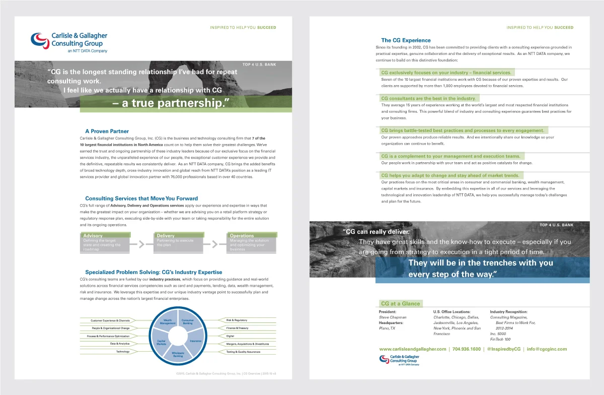
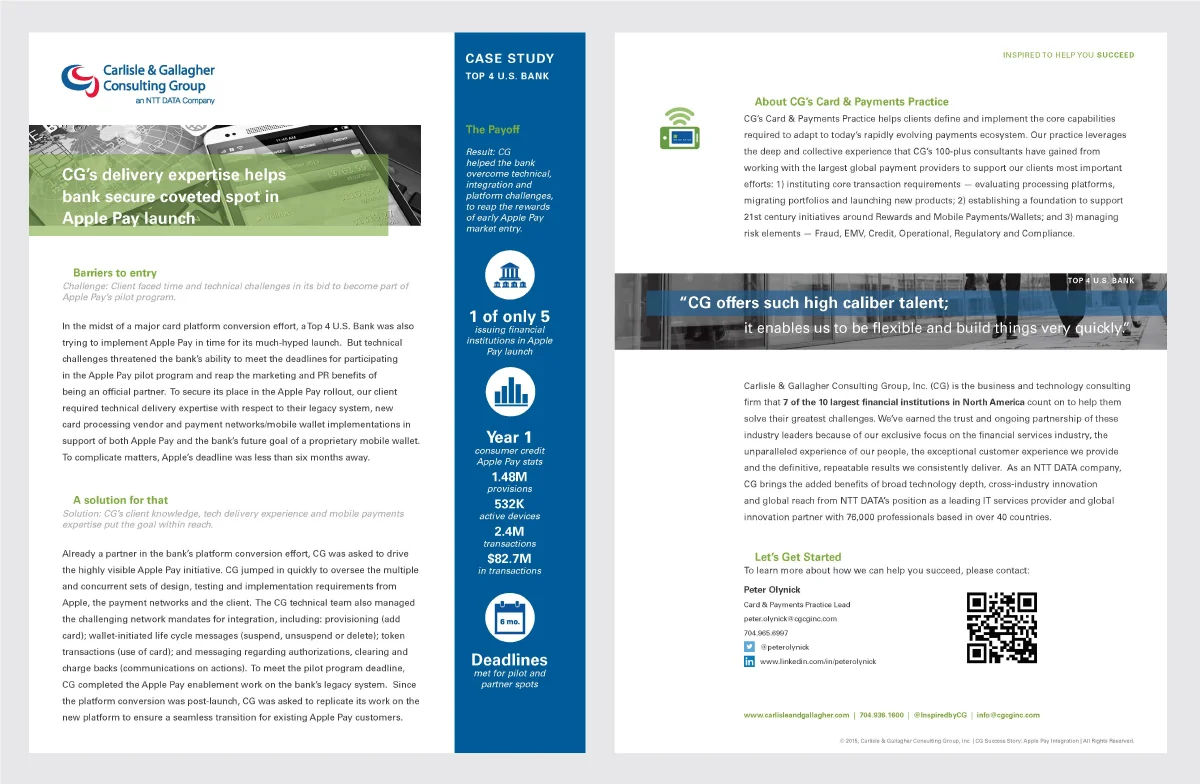
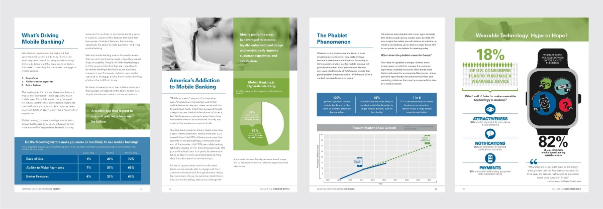
A lot of work. This was a huge effort executed in a tight timeframe. Visual elements (photography and spot color) coupled with client quotes drove the brand identity and collateral. The first piece created was our CG Corporate Overview Fact Sheet and that anchored the rest of our collateral library. I created a fact sheet template for our capabilities as well as one for our case studies. Additionally, company stationery (including business cards) and social media graphics needed to be reimagined to fit our new scheme. Finally, the biggest effort was around our PowerPoint template and Corporate Overview Slides. In a consulting firm, where PowerPoint presentations are table-stakes, we designed not only a branded PowerPoint template, but also one that would be easy for our consultants and enable them with the tools they needed to present and uplift the content they were sharing (outside of just a bulleted list).
In addition to thinking about the visual brand creation and deliverables associated with that, I also had to think about how to communicate this shift to the CG Marketing Team as well as our employee base. I created a communication plan along with training for the wide employee base as well as various factions of our consultants that would regularly use our materials. In addition to walking them through the new tools, I grounded the training in the importance of brand and being good brand ambassadors.
What resulted was a very successful launch with employees jazzed and re-energized by our new materials. Clients and employees alike responded to our new look and clean content.
the services
Brand Strategy
Brand Design
Brand Development
Social Media Design
Collateral Design
PowerPoint Design
Training Development & Execution
Art Direction
Project Management


